Wednesday, May 15, 2013

Semantic Mediawiki Update

Way back in 2008, I wrote my first posts on Semantic Wikishow I chose Semantic Mediawiki, and even got into a discussion with Jack about their value.

When I came to ProModel last year, I was able to have Semantic Mediawiki installed and started using it as a knowledge repository for the development team.  I store the following kinds of information in the wiki:

  1. Background information about the customer, their requirements, business rules, their business and their field.  Particularly useful is an encyclopedia of all of the terms that are used in our application and in design discussions.  This is what Mediawiki was built for and what it excels at.
  2. Notes from meetings, usability research and customer feedback.  These tend to be semi-structured and used as references for designs.  The "Semantic" extension of Mediawiki allows me to mark up my notes with category and property tags so that they can be organized and found later when I need them.
  3. Finally, I write the complete user interface specification in the wiki.  The wiki gives me a quick and easy way to publish on our intranet and share with the customer.  The semantic tags allow me to slice and dice the specification for analysis (e.g., show me all the screens that have an "Export" button) and integration with my cool automated testing rig (see my earlier posts on Sikuli).  A nice benefit of driving your testing directly from the specification is that it forces the specification to be up-to-date (or the tests fail).
Benefits of Semantic Mediawiki:
  1. It's free and open source
  2. It's very reliable
  3. Tons of free and open source extensions
  4. Quick and easy way to publish online with semantic tags to for retrieval, analysis and automation
Drawbacks of Semantic Mediawiki:
  1. Like all open source projects, you need to be somewhat technically savvy to install, configure the product and its extensions.
  2. The Semantic Mediawiki extension is not perfectly compatible with some other useful MediaWiki extensions
  3. Not everyone is comfortable writing on a wiki.  Adoption can be sporadic.
Overall, I'm happy with the product, but I would consider other options that may have the same benefits with less of the drawbacks.  However, many of the best options are not free and charge a monthly, per user fee.  For example, I have used the Socialtext and Sharepoint wikis previously and they seem to be more usable (in some ways), but less semantic and much more expensive.

Tuesday, April 2, 2013

The Visual Style Guide


Following up on my earlier post about the UX Team, I'm currently collaborating with a graphic designer at work to put together a visual style guide for my web-based application.  It's intended to be a reference for our developers, showing how all of the visual elements work together and supporting consistency throughout the application. A visual style guide often includes specifications (with examples) for the use of logos, typography, color, layout, and navigation.


It has been a while since I sampled the internet for examples of this type of documentation, so I spent some time this morning googling around and found the following resources:

  • Yale Visual Identity: This is a classic example of a visual standard that typically comes from a marketing department and specifies how to use a logo, color and typography in printed products and online to best communicate a particular brand.
  • SAP Interaction Design Guide: A comprehensive guide that includes logo, typography, layout, navigation and much more.  The guide seems a bit dated, but is an excellent example of the type of content that you'd like to see in a full featured style guide.
  • BBC Global Experience Language: An extensive reference similar to the SAP guide above.  This guide also specifies a particular layout grid and examples of how the various visual elements layout on the grid.  Interestingly, I find the printed version to be much easier to use.
  • New School Web Style Guide: A good example of a much smaller, but still useful visual style reference.  You could produce something like this quickly and then iterate on it as needed.
  • UX Guidelines for Metro: Metro is a design language created by Microsoft used in Windows Phone and Windows 8.  The project I'm currently working on uses Microsoft Silverlight (but not Metro), so I'm interested in looking to see how this might apply.


Thursday, February 28, 2013

The User Experience Team

After researching and writing my last post on Strategic UX Design, I started thinking more about how I've spent my time at the various organizations that I've worked for.  Early in my career I spent a good bit of time as a UI developer and later as a researcher and project manager for UI-intensive projects.

If I map my experience onto the 5 Competencies of UX Design diagram from UX matters, I've heavily invested my time into Interaction Design and Prototype Engineering with quite a bit of Information Architecture recently, and scattered, intense periods of Usability Engineering and Visual Design.  In terms of UX Strategy, I've some time on it at the beginning of each project. However, it's often hard to maintain a focus on strategy within the context of the daily grind of software design and development.

It's not surprising to note that my most successful and productive periods of UX work have come while working within a good team.  When two people are working well together, it can more than double your productivity.  The same can be true (to a lesser extent) for larger teams if you have quality people and good leadership.

In some of my past projects, I've been lucky enough to work with trained and experienced UX professionals.  In other cases, I was able to recruit and develop folks with other backgrounds such as documentation, testing, UI software development, business analysis and graphic design.

In this post, I want to capture my model of the roles a good UX team. Often two or more of these roles are filled by a single person (based on resources available for UX design), but to the extent that the roles can be filled by quality specialists (perhaps borrowed from other groups in the organization), you can expect to see corresponding performance improvements.
  • UX Lead: (objectives, strategy, total customer experience, interface with other leads [dev, qa, marketing, sales, senior management?], UX process and integration, manage team, prioritization)
  • Business Analyst/Research: (understand and document business needs/rules/requirements, research and document information architecture and terminology, help develop value map, interface with customers, other business analysts, documentation team, marketing and sales)
  • Interaction and Visual Design: (UI logical framework, look and feel standards, contribute to UI specifications/prototypes for each UI element (screen, control, etc.), ensure designs meet measurable objectives, interface with marketing and dev)
  • Usability Testing/Research: (set up and run usability tests/research, document findings, track and document usability issues / feature requests, interface with QA team, overlap with UI functionality testing, ensure that UI conforms with specs and standards)
  • Prototype/UI Engineering: (develop UI framework and reusable components, rapid prototyping of new designs, help translate new designs into production code, interface with dev)
Note: I referenced the excellent resource, 5 Competencies of UX Design, as I was writing this up.  You should expect to see a good amount of overlap.

Not sure if this doodle adds anything to the post, but it was fun to draw. :-)

Wednesday, February 27, 2013

Strategic UX Design


Recently, I've been thinking quite a bit about strategic UX design. I'm sure there are many ways to think about this, but here's my cut:
  • Tactical UX Design is about using specific tools and techniques to design a particular user experience.  UX matters provides a nicely organized list of UX techniques and work products in their 5 Competencies of UX Design diagram (see below).

Nicely organized list of Tactical UX Design skills and work products from UX matters
  • Strategic UX Design is where an organization decides how to apply its limited resources to achieve some effect.  This should be a measurable effect (i.e., key performance indicator) such as an impact on sales, improved user satisfaction, reduced training, improved throughput/task completion, error reduction, etc.  I think Leisa Reichelt's diagram (see below) does a nice job of describing the relationship between business strategy, UX strategy and UX tactical execution.
A model of the relationship between business strategy and UX from Strategic UX.
From my perspective, the key UX strategy activities include the following:
  1. Setting the Scope and Objectives: It's worthwhile to spend a little time thinking about who the "Strategic UX Thinker" is reporting to (CEO, CTO, Project Manager, Product Manager, etc.), what their goals are, and how they and their goals relate to the rest of the organization.  UX is often housed in the development department, but it requires input and has an impact on other parts of the business including sales, marketing and other products.
  2. Understanding the Customers and their Contexts: This step identifies the "big picture" of the software experience.  What kind of situations are the users in when they are using the software?  How are they feeling and how do we want them to feel? What challenges are they facing and how can we help? Here is where you should be able to identify "big picture" issues and opportunities that a company can address.  Contextual Design, Personas, and Value Maps are three key techniques for capturing and communicating this information.
  3. Teamwork and Process: I've been in enough organizations to know that UX can work in just about any kind of team and software development process.  Key strategic UX issues include:
    1. How are the UX objectives prioritized relative to other product objectives and are there sufficient resources to meet the short-term and long-term UX objectives?
    2. What is the organizational structure and development process and how do they evolve over time to meet new needs?
    3. How is organizational knowledge of the customer captured, communicated and utilized within the organization?
Well, that's it for this post.  If you're interested in reading more, here's a nice list of other resources on the topic of Strategic UX Design:

Tuesday, February 26, 2013

A Simple Scala Internal DSL

My earlier posts have talked about why I'm using Scala to create a DSL for documenting user interface procedures.  I also introduced Sikuli and posted a simple Java program for capturing on-screen images and then later using the Sikuli vision library to find them on the screen and click them.

In this post, I will model a very simple Internal DSL in Scala that can execute this script:
Click the "OK".button;

As you can see, as is the case with internal DSLs, I couldn't quite get the syntax the way that I wanted, but it's pretty close.  A lesson learned is that you can use internal DSLs in situations where you aren't too picky about the syntax.  In my next post I will share an external DSL that has the exact syntax that I want (and some other benefits also).

Here's how to read the code (at the bottom of this post):

  • Imports
  • I create a Scala object (MehtodRunner) that extends App (basic Scala stuff)
  • I create the Sikuli screen object (main object for executing Sikuli commands)
  • I create the "Click" object (the first word in my syntax example above)
  • I define a "the" method (second word in my syntax) which takes in a single Component as a parameter.
    • When called, it creates an image filename and checks to see if the file exists or not.
    • If it exists, it asks Sikuli to find a matching image on the screen and click it.
    • If it does not exist, it asks Sikuli to capture the image and store it for the next time.  See my last post for a more in depth explanation of how this works.
  • The next section converts the "OK".button syntax into a Component object.  It's basic Scala Internal DSL stuff.  For more information on this topic, take a look at Designing Internal DSLs in Scala by Debasish Ghosh.
  • There is a section that does the work of capturing screenshots in Sikuli (called from "the" method above).  Again, see my last post for an explanation.
  • Finally, I embed the Click the "OK".button; script inline.  This is one of the benefits (and drawbacks) of an internal DSL.


----

import org.sikuli.script.ScreenHighlighter
import org.sikuli.script.Screen
import org.sikuli.script.Location
import org.sikuli.script.CapturePrompt
import org.sikuli.script.Observer
import org.sikuli.script.Subject
import java.io.File
import org.sikuli.script.Pattern
import javax.imageio.ImageIO

object MethodRunner extends App {

  // =============================
  // Sikuli screen object
  var screen = new Screen()

  // =============================
  // Script Actions  
  object Click {
    def the(in: Component) {
      println("Click the " + compDesc(in))

      var filename = safeFilename(in);
      println(filename)
      var file = new File(filename);

      if (file.exists()) {
        screen.click(new Pattern(filename));
      } else {
        captureComponent = in
        cp.prompt("I don't know what the '" + compDesc(in) +
          "' looks like.  Please select it.");
      }
    }
  }

  // =============================
  // this supports the syntax "OK".button
  implicit def toComponentBuilder(in: String) =
    new ComponentBuilder(in)
  class ComponentBuilder(name: String) {
    def button(): Component = {
      return new button(name);
    }
  }

  abstract class Component(val name: String)
  class button(name: String) extends Component(name)
  def compDesc(in: Component) = in.name + "." +
    in.getClass().getSimpleName()

  // =============================
  // capture and store screenshots for Sikuli 
  var cp = new CapturePrompt(screen)
  cp.addObserver(CaptureObserver)
  var captureComponent: Component = null

  var USER_HOME = System.getProperty("user.home");
  def safeFilename(comp: Component) = USER_HOME +
    "/Method/img/cache/" + comp.name.replaceAll("\\W+", "_") +
    "_" + comp.getClass().getSimpleName() + ".png";

  object CaptureObserver extends Observer {
    def update(s: Subject) {
      var img = cp.getSelection()
      ImageIO.write(img.getImage(), "png", 
          new File(safeFilename(captureComponent)));
      cp.close()
    }
  }

  // =============================
  // The Script

  Click the "OK".button;

}

Tuesday, February 12, 2013

Sikuli Trick: Capturing images with the Sikuli Java library

In my last post, I introduced Sikuli, talked about its capabilities and power, and posted a very small code sample that showed the basics of using the Sikuli Java library.

In that code sample, I showed how you could use Sikuli to load an image, search for it on the screen, and click it.  However, there is a big gap in that workflow -- if everything is based on images in Sikuli, where do all of those images come from?

Luckily, Sikuli provides a very nice capability to support the selection, capture, and storage of images from the screen.  If you use their UI, you get it for free.  It's also available in the Java library, but it's not well documented, so I'll post it here for future Googlers to find.

The interesting difference between the code below and the code from my last post happens when the image file does not exist (!imageFile.exists()).  The CapturePrompt.prompt() call freezes the screen and gives you a crosshair to make a selection.  This selection is then passed as a ScreenImage object to the update() callback.  I retrieve the Image object and save it as a file.  This happens the first time the program is run.  Each subsequent time the program is run, it will find the file and then click it.

In my next post, I'll tie this back to the Scala DSL that I posted about on Jan 30 and Feb 4 to make an English-like language for describing procedures that the computer can execute.

----


import java.io.File;
import java.io.IOException;

import javax.imageio.ImageIO;

import org.sikuli.script.CapturePrompt;
import org.sikuli.script.FindFailed;
import org.sikuli.script.Observer;
import org.sikuli.script.Screen;
import org.sikuli.script.ScreenImage;
import org.sikuli.script.Subject;

public class SikuliExample2 {

  public static void main(String[] args) {

    // Create a Sikuli Screen object.
    Screen screen = new Screen();

    // Specify an image that we'd like to click
    String USER_HOME = System.getProperty("user.home");
    String buttonImage = USER_HOME + "/Sikuli/OK_Button.png";
    final File imageFile = new File(buttonImage);

    // If the image file doesn't exist, screen grab 
    // Note, this only needs to be done the first time
    if (!imageFile.exists()) {
      final CapturePrompt cp = new CapturePrompt(screen);
      cp.prompt("'OK_Button.png' not found. Please select it.");
      cp.addObserver(new Observer() {
        public void update(Subject arg0) {
          ScreenImage img = cp.getSelection();
          try {
            ImageIO.write(img.getImage(), "png", imageFile);
          } catch (IOException e) {
            e.printStackTrace();
          }
          cp.close();
        }
      });
    } else {
      // Find the button and click it.
      try {
        screen.click(buttonImage);
      } catch (FindFailed e) {
        System.out.println("Couldn't find: "+buttonImage);
      }
    }
  }
}

Friday, February 8, 2013

Sikuli: An "On Screen" Computer Vision Library

In my last post, I briefly mentioned Sikuli as a tool that I've been using in combination with other technologies for usability analysis and automated testing.  However, before I get deeper into how I've been using it, this post will give my overview on what Sikuli is and why I think it is so useful.

If you go to the Sikuli website (http://www.sikuli.org/), you'll see Sikuli described as a tool for either: 1) running macros, or 2) automated software testing.  It can do both of these things quite well, but it's important to note that Sikuli is much deeper and more powerful than other tools that can do this.

From my perspective Sikuli consists of several parts:
  • Open CV: Sikuli utilizes the Open CV computer vision library. This is where the real power comes from.  Unlike traditional macro and software testing tools, Sikuli is based on vision.  If you can see it on the computer screen, so can Sikuli.  It's not perfect (text recognition is a weakness), but it can handle situations that other tools can't.  For example, you can write a Sikuli script to play a game that is written in Flash (or Silverlight, or HTML, or C++) even if it doesn't have an API.  As long as there are things to see and react to, Sikuli can be used.
  • CV Tuned to the Computer Screen: This isn't really a separate 'part' per se, but it's so important that it's worth it's own bullet.  Computer vision is such a broad and deep topic that an average joe that tried to download Open CV and use it for recognizing something on the computer screen would have a lot of learning and work to do.  The creators of Sikuli at the MIT User Interface Design Group did all of this work and bundled it into Sikuli for you.
  • Java API: The base implementation of Sikuli is written as a Java library.  You can bundle this into any Java application.  It's my preferred method of using Sikuli.
  • Custom UI and Jython: This layer is a nod towards usability for non-programmers.  There are some cool features here, but as a programmer, it doesn' really fit what I'm trying to do.
Below I've provided code that shows the simplest possible example of using the Sikuli Java API to do something.  Here's what it does:

  1. First, I provide the location of a screenshot of an OK button that I'm going to ask Sikuli to find and click for me.  In future versions of this program, I will check right here that the file really exists (and if it doesn't exist, I will have Sikuli help me create it).
  2. Next, I create an instance of the 'Screen' class.  It's the starting point for most of Sikuli's functionality.
  3. Finally, I have a try-catch block where I ask Sikuli to find something that looks like the "OK_button.png" on the screen and click it.  It might fail for two reasons: a) the file doesn't exist, or b) it exists, but there is nothing on the screen that looks like it.
This is a pretty simple program that doesn't really show the full power of Sikuli, but I wanted to lay out the basics before I start to get into some really cool stuff in my upcoming posts...

----

import org.sikuli.script.FindFailed;
import org.sikuli.script.Screen;


public class SikuliExample1 {

 public static void main(String[] args) {

  String USER_HOME = System.getProperty("user.home");
  String buttonImage = USER_HOME+"/Sikuli/OK_Button.png";

  Screen s = new Screen();

  try {
   s.click(buttonImage);
  } catch (FindFailed e) {
   System.out.println("Couldn't find image: "+buttonImage);
  }

 }

}

Monday, February 4, 2013

Documenting Use Cases / Tasks / Procedures

One of the fundamental ideas in the design of tools (software or otherwise) is that you must start with an understanding of the purpose of the tool -- 1) the people who will use it, 2) their goals, 3) the context, and 4) the process of use. In software and other complex systems, capturing, organizing and communicating this knowledge can be one of the most difficult parts of the work.

There are numerous techniques for gathering this data -- typically observation and interview-based -- drawn from job analysis and ethnography.  It's a great topic, but this article is about the next step, organizing, communicating and utilizing the data after you've gathered it.

In particular, this article is about notation.  Once you start to gather large amounts of data about your users, who they are and what they are doing -- how do you effectively document that data so that it can be understood and utilized for your analysis and design work?

Everyone who designs software has to grapple with this problem.  One simple approach used in extreme programming (and ad hoc programming) is to rely on one or more experts that have the knowledge (or can get it on demand) and can answer questions as they arise and provide quick feedback on designs as they develop.  More traditional software engineering utilizes formalisms such as UML.  Somewhere in between you have semi-formal methods such as Contextual Design.

If you do choose to write down information about the users and their tasks and goals, you can find a number of good references to help you decide exactly what to capture, but I think it boils down to a few basic elements based on the 5 Ws.
  • Who will be using your software? (actor)
  • What are they trying to do and why? (goal)
  • How do they do it? (procedure/method)
  • Where and when do they do it (context/selection rules)
As I described in an earlier post, I'm particularly interested in representing this data in Domain Specific Languages (DSLs) such as GOMSL. For the past several months I've been working on my own implementation of a DSL for documenting procedures.  I want my language to be as human-readable as possible, so I've based it on procedure writing standards described in the Microsoft Manual of Style for Technical Publications.

Basic Form
A procedure starts with a single line in the following pattern: "To :" and is followed by one or more steps. Each step starts with an asterisk(*) and ends with a period(.). A simple step has the following pattern:
* the "

Here's a small example use case:

To Open_About_Box:
   * Click the "DST-SM" icon.

There are more complex variations of a step to deal with things like looping, conditionals and calling of other methods, but this post is getting a bit long so I'll just end it here for now.  Stay tuned for some longer examples and some sample code that can parse this language and do some cool things like drive the UI and calculate some usability metrics.


Wednesday, January 30, 2013

Using Scala and Sikuli to create a DSL for analyzing and testing UI Methods

Ever since I first read about GOMS, I've been intrigued by the idea that you could write a description of a process that was both human readable and parseable by a computer.  A language like this could have multiple benefits:
  • The instructions to users could double as form a type of automated UI testing -- potentially giving you two benefits for the cost of one.
  • You could guarantee that the instructions that you provide to users were correct.  Incorrect instructions would fail to execute during your automated testing (which could be run after every build).  This would catch cases where the developers change the UI without informing the documentation, testing and/or specification teams.
  • The instructions could be analyzed using the GOMS methodology to give you free usability metrics (time to complete, learnability, some types of error prediction).
  • Other types of analysis related to the structure of the user interface (e.g., which screens and/or controls are most documented, how similar are the procedures used on different screens, etc.)
My interest in this area lead me to pursue my Masters in HCI at Carnegie Mellon with Bonnie John and later work with David Kieras while I was at Soar Technology.  This work was documented in the following papers:
  • Hudson, S. E., John, B. E., Knudsen, K., & Byrne, M. D. (1999). “A Tool for Creating Predictive Performance Models from User Interface Demonstrations.” Proceedings of the ACM Symposium on User Interface Software and Technology, pp. 99-103. New York: ACM Press.
  • Kieras, D., and Knudsen, K. (2006). Comprehensive Computational GOMS Modeling with GLEAN. In Proceedings of BRIMS 2006, Baltimore, May 16-18.
Unfortunately, funding for that work was not continued, but as I started my User Experience Design work at ProModel -- including elements of UI analysis, specification, documentation and testing -- I was reminded again of the benefits of having a human and machine readable language for describing procedures.

For various reasons, I decided to take a fresh approach.
  • I designed my own Domain Specific Language (DSL) based on the guidelines found in the Microsoft Manual of Style for Technical Publications.
  • I tried various methods to encode my DSL.  I've been most happy with Scala so far and will have some posts about my experiments with both it's internal and external DSL capabilities.
  • I've also incorporated Sikuli (a computer vision-based testing library) to provide a mechanism for automatically executing my procedures.
Well, I guess this is long enough for an introductory post.  Stay tuned for a series of posts that document my prototypes and results thus far...

Friday, December 21, 2012

AutoHotkey Script for a Left Hand Menu

Recently, I've started posting AutoHotkey scripts.  AutoHotkey provides a pretty easy way to automate just about anything in Microsoft Windows without having to become a Windows programmer.  If you'd like to learn more, LifeHacker has a pretty nice introduction to AutoHotkey.

In my last couple of posts, I've been talking about tools and techniques to make it easier to keep your right hand on on your pen when you're drawing using a Wacom tablet, for example.  This script also works pretty well for keeping your right hand on a mouse.

Basically, when you run this script the Win+A key will bring up a window and while the window is open the ASDF keys can be mapped to execute ANY command.  Currently, I'm just popping up test messages, but as a next step I'll be adapting this basic framework to to cover my most common actions while working in Adobe Illustrator, for example.

---


; Left Hand Menu

#a::
Hotkey, a, Test, On
Hotkey, s, Test, On
Hotkey, d, Test, On
Hotkey, f, Test, On

Gui, Font, s10, Verdana  ; Set 10-point Verdana.
Gui, Add, Text, ym, (A) Test 
Gui, Add, Text, ym, (S) Test 
Gui, Add, Text, ym, (D) Test 
Gui, Add, Text, ym, (F) Test 
Gui, Show, w500 h100, Left Hand Menu
Return

GuiClose:
Hotkey, a, Off
Hotkey, s, Off
Hotkey, d, Off
Hotkey, f, Off
Gui Destroy
Return

Test:
MsgBox You pressed %A_ThisHotkey%.
return

Ergonomics of Working with a Graphics Tablet

David Revoy has one of the best articles I've seen about the Ergonomics of Graphics Tablets.  He has experimented with a variety of tablets and desk layouts and, best of all, created these very clear diagrams (such as the one below) to illustrate his article.


As Revoy shows and explains, "Most of CG artists use shortcuts on the keyboard to speed up their work-flow."  In this setup, the right hand is for drawing and the left hand is for shortcut keys (critical for switching between drawing tools, copy & paste, etc.).  The right hand moves back and forth for typing.

I'm writing this post as background for some UI research that I've started doing to improve the usability of software for artists and other pen-heavy users.  The first example is the script I wrote in AutoHotkey to set the location of the Tablet PC Input Panel.

Up next, I'll be looking at the Quill gesture design tool for pen-based user interfaces.  I think some interesting things could be done with simple gestures (like Graffiti unistrokes) in a vector drawing tool that haven't really been explored yet.  I'd like to explore rough drawing text, shapes, etc. and having the computer recognize it and convert it to a desired format in place.  Done right, I think it could lead to a more natural drawing experience while still maintaining the precision of vector drawing tools.

Tuesday, December 18, 2012

Tablet PC Input Panel and AutoHotkey

As someone who does a lot of drawing, I like to use pen input.  I've used Wacom tablets and, recently, a Samsung Slate Tablet PC.

Like a mouse, a pen input device usually takes up one hand with the other hand on the keyboard for triggering shortcut keys.  This works really well until you have to enter text.  As Allen Newell showed in The Psychology of Human Computer Interaction, moving your hand back and forth from the keyboard to mouse (or pen) can be really disruptive.

The interesting thing about a pen as an input device is that, unlike the mouse, it is very natural to enter text with a pen and Microsoft has very good handwriting recognition built into the Windows operating system starting with Windows XP.  There is a little panel, called the Tablet PC Input Panel (TIP) that can be configured to pop up, accept handwriting, and then output text as if you had typed it.

In general, I've found it to be very useful when I'm drawing some UI design and I want to input little bits of text (labels, buttons, menus, etc.) in the drawing.  One main drawback is that I could never get the TIP to show up exactly when and where I wanted it.

Luckily, with a little tinkering in AutoHotkey, I was able to get exactly what I want -- to have the TIP appear right below my cursor.  The TIP window is a bit odd and can't me moved with the normal AutoHotkey WinMove function so I wrote a script that uses the mouse to drag it into place.  I'm posting the script below to save the next guy the trouble.

----

; Triggered by Win+Z (windows key and Z)
#z::
IfWinNotExist, ahk_class IPTip_Main_Window
   Run, TabTip.exe
Else
   WinShow, ahk_class IPTip_Main_Window


WinGetPos, tipX, tipY, , , ahk_class IPTip_Main_Window
CoordMode, Mouse, Screen
MouseGetPos, mouseX, mouseY
MouseClickDrag, Left, tipX+200, tipY+20, mouseX+100, mouseY-50
MouseMove, mouseX, mouseY


Return


Wednesday, July 18, 2012

UX Design of a Self-Organizing Volleyball Tournament

One of my hobbies is volleyball.  I used to play about once a week or less, but lately I just can't get enough of it.  I play mostly through the Ann Arbor Rec & Ed and a Meetup.com group called the Ann Arbor Adventure Club.  I play enough with the Adventure Club that I was asked to help organize a doubles volleyball tournament.

Organizing one of these things is a bit trickier than you might expect, especially if you want everyone to have a good user experience!  Also, this group has some unique constraints that hindered a previous attempt to organize doubles volleyball.  In particular, people want the events to be low cost and casual (i.e., drop in when I can).  There are other leagues that cost more and require more of a commitment.

Anyway, by the time I was done organizing this thing, I realized that I had essentially done a small user experience design project -- complete with a visual interface (a printable form - see below).  It gets it's first test on Sunday, but I thought I'd capture what I had done while it's still fresh in my mind.  I'll come back and do another post to let you know how well it worked.

Goals (i.e., Requirements / Constraints)
  1. High-quality doubles play: If you can't bump, set & spike somewhat consistently, please take yourself off of the list -- the Thursday night games are oriented towards all levels.
  2. Resiliant to "no shows": The first four people to show up will just start playing. Then the next four. After that, we will rotate people in order. Because of this, there won't be fixed teams -- you'll be randomly (sort of) paired with teammates. Still, it would be nice if you would update your RSVP if you know you can't make it.
  3. Mostly playing, with some rest: With 2 courts, 8 will be playing at one time. You'll be playing at least 2/3 of the time if all 12 show up. To maximize playing time, there should be no breaks between games (or just very short ones). If you need a rest, let someone play your slot and then you can catch the next one.
Process Design
  1. When you arrive, sign in on the spreadsheet (see below).
  2. We will use Ann Arbor sand league rules (no set overs, cannot set receive serves, no tipping, carries, etc.). Call your own and your partner's fouls.
  3. Once 4 arrive, players 1-4 start playing on the court of your choice. Play 2 games to 21 (first to 21 wins, do not have to win by 2). Players 5-8 start playing on the other court. Players 9-12 wait.
  4. When your game is done, each player tallies their wins and losses on the spreadsheet. Each game counts. For example, if players 1 & 2 split the first match against players 3 & 4, they would each mark down 1 win and 1 loss.
  5. After the first match is over, players 9-12 would play against players 1-4. If we don't have 12, or if somebody from 1-4 needs a rest, just keep going in order. So if we have only 11 and player 4 needs a rest, it would be players 9, 10, 11 & 1 against players 2, 3, 5 & 6 (players 7 & 8 would wait).
  6. One important rule is that you must have a different teammate for each match.
  7. Keep rotating for a couple of hours. Always the players with the fewest number of games played get to go next. Ties go to the player who signed in first (e.g., player 4 goes before player 5 if they've both played the same number of games).
  8. At noon, we'll set up for the championship match. The player with the best record plays with the second best player against the 3rd and 4th best players. The second court will have the 5th & 6th ranked players against the 7th and 8th for in a consolation match.
Visual Artifact Design (printable sign in & tracking sheet)

The goal of the sheet below was to embed the process described above.  Some specific design details include:
  • You are automatically assigned a number by signing in.
  • The first 8 players have their teammates assigned automatically by the sheet.  This also serves to teach the players how to fill out the form.
  • The "Games Won" columns indicate what you should fill in (a value between 0 and 2) and embed some of the format information (2 games per match).
  • As each player fills in their teammate and games won information, it will become visually apparent who plays in the next game -- it will be the left-most, top-most empty cells.  I think this feature will significantly add to the user experience since I think the most likely point of confusion will be figuring out who plays next. (Remember that we're playing with flexible teammates and schedule).
  • The match columns headers are rotated 90 degrees to allow room for descriptive labels within the constraints of the page width.
  • A double grid and thin lines clearly indicates where to enter match data.  I might consider alternating light grey rows to make this even more clear in the next version.

Wednesday, June 27, 2012

Design Quotes

I've been doing a bunch of reading over the past six months as I've made the transition from SoarTech where I was a bit of a jack-of-all-trades (project manager, proposal writer, programmer, designer, etc.) to ProModel where I am back to being primarily a visual and UX designer.  As I've been reading, I've been collecting a list of good quotes about design.  Thought I'd take the opportunity to share the best ones.

No design works unless it embodies ideas that  are held common
by the people for whom the object is intended.
--Adrian Forty

Notation is a tool of thought. 
A problem properly represented is largely solved.
-- Philosophy 101

Essentially, all models are wrong,
but some are useful.
-- George Box

The minimal requirement in design is
the organization of all the parts into a unified whole.
-- Eugene Larkin

Simple designs present the minimum amount of information
to achieve maximum effect ... by reducing and regularizing.
-- Michael Terry

Two golden rules of information visualization:
1) show the data, 2) show comparisons.
-- Bret Victor

A proper visualization is a kind of narrative,
providing a clear answer to a question without extraneous details.
-- Ben Fry

Make frequent tasks easy and infrequent tasks possible.
-- Usability Maxim

God is in the details.
-- Ludwig Mies van der Rohe

Friday, June 22, 2012

Script to Extend the Artboard in Adobe Illustrator

It's pretty easy to change the size of the artboard (i.e., canvas) in Adobe Illustrator, but as I've said in some previous posts I've started to experiment with large format wireframes / navigation diagrams.  When you zoom way out (or print small) it looks like a navigation diagram, but you can zoom way in (or print poster size) to see the wireframe details.  I'll put up an example in a later post.

Anyway, I tend to start with the artboard at tabloid (17x11) or 2x tabloid (34x22) and then grow the artboard incrementally as I go.  I change the artboard regularly enough and in such a predictable way that I went ahead and made the script below:

----

if (documents.length == 0) {
    alert("Must have a document open!");
}


TABLOID_LANDSCAPE_W = new UnitValue (17, "in");
TABLOID_LANDSCAPE_H = new UnitValue (11, "in");


curWidth = activeDocument.artboards[0].artboardRect[2];
curHeight = activeDocument.artboards[0].artboardRect[3];


isWidth = confirm("Extend width?");

if(isWidth) {
    newWidth = curWidth + TABLOID_LANDSCAPE_W.as("px");
    activeDocument.artboards[0].artboardRect = [0,0,newWidth,curHeight];
} else {
    newHeight = curHeight -TABLOID_LANDSCAPE_H.as("px");
    activeDocument.artboards[0].artboardRect = [0,0,curWidth,newHeight];
}


----

It's pretty simple, but I thought I might as well share the idea and the script for whomever might find it useful.  Here's how it works:
  1. First check to make sure a document is open.
  2. Define the width and height that I'm going to use to extend the artboard.
  3. Get the current width and height of the artboard.
  4. I use a confirm dialog to ask if you want to extend the width, otherwise the script will extend the height.
  5. Finally, calculate the new width or height and extend the artboard.

Wednesday, June 20, 2012

Prezi in Adobe Illustrator. Part 1: Setting a Timer in Adobe Javascript

I've always really like poster-sized images in Illustrator for displaying site navigation diagrams.  You can zoom out to get a "big picture" view and then zoom in on the details.  Meng He shows a nice example of this in here Shindig Wireframe on Dribbble.  To get the full effect, click on the PDF version and then use your pan and zoom tools to explore.

This kind of document navigation reminds me alot of Prezi, the non-linear presentation software that Brian Stensrud turned me onto.  I've never used Prezi itself, but I've given presentations in that style (without the rotation).  There are two free javascript libraries that I know of that do similar things, dizzy.js and impress.js.

The basic idea behind all of these tools is very simple.  You define a sequence of frames on top of a large vector image and then use a script to navigate between them.  I've written a rough Adobe Illustrator script that does this already.  I'll upload the complete script in a later post.

One problem that I was having was animation.  In my current script, the pan and zoom just jump around.  This is fine, but you lose the context of the larger space, so I was looking for a way to do a simple linear animation between two zoom and pan states in Illustrator.  In a browser, you can call setTimeout() to get a callback after a period of time, but that method doesn't exist in the Adobe Illustrator version of Javascript.
Luckily, I was found a great post on stackoverflow that provided the answer.  Here's the code:

  $.setTimeout = function(func, time) {
        $.sleep(time);
        func();
  };

  $.setTimeout(function () {alert("hello world")}, 3000);

UPDATE: After trying to get animation running in Illustrator in several different ways, I'm giving up on it. The Illustrator UI never updates until my script is finished. The "sleep" function below doesn't seem to work the way I thought it might.  My next attempt will be to dump the SVG from Illustrator into an HTML 5 file and use dizzy.js or impress.js (see links above) to do the animation.

Sketchy Wireframes in Illustrator

I won't go into all of the reasons why it might be good to present hand-drawn concepts to customers and users early in the design process.  It's a well-established idea and seems to work well for a number of people (for example, see articles by Dirk Weber and James Landay).

Personally, I also think it really looks cool (take a look at some great examples over on Dribbble) and, as Don Norman taught us, Attractive Things Work Better.

So all of this leads to a recent problem and solution that I'd like to share in this article.  The problem is that I can't hand draw attractive concepts.  I've never had the training and despite several attempts, I never seem to be able to put enough time into it -- work, family and life keep interfering.

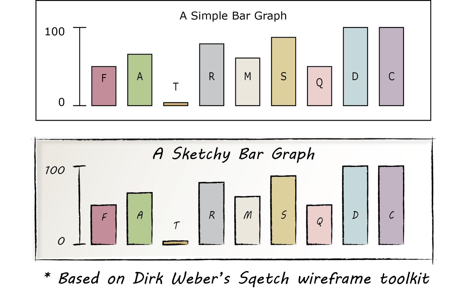
A solution came about as I was googling Illustrator wireframe toolkit and found Sqetch.  As you can see below, it can be used to create attractive, sketchy wireframes.


Sqetch has a couple of problems from my perspective.  The first is that it loads very slowly.  See all of those textured backgrounds?  My laptop takes its time rendering them.  That makes it not fun for rapid prototyping.  The second problem is that it almost looks too good for initial prototypes.

However, there are some things that I learned from the toolkit.
  1. You can make any path look like pencil in illustrator by using the right sketchy brush.
  2. If you do that and turn your rectangles into four slightly overlapping lines, it you get that "hand drafted" style.
  3. Use a hand drawn font.  Sqetch uses a font called Nymph's Handwriting, but Microsoft has some built in that work just fine.  I'm using MV Boli right now. Segoe Print is also good.  Also, the Google Webfonts project has a nice one called Delius.
  4. With care, you can use gradients, transparency and brushes if you want some of the textures that you see above.
  5. You can save UI elements (buttons, text fields, etc.) in Adobe Illustrator as Symbols for rapid reuse.
I applied the elements above to a simple graph that I created in illustrator.  You can see the results below:


UPDATE: Found a nice tutorial that shows how to make any font look sketchy.  The tutorial is for fonts, but you could use this anywhere you want a rough "crosshatch" fill.  The secret is to use the "scribble" effect on the fill and the "roughen" effect on the stroke from the Appearance panel.  Here are the specific settings they use on those effects:
  • Scribble: Angle to 45, the Path Overlap to 0 px, the Path Overlap Variation to 2 px, the Stroke Width to 1 px, the Curviness to 0, the Curviness Variation to 50, the Spacing to 2 px, and the Spacing Variation to 1.5 px
  • Roughen: Size to .5, select the Relative radial button, change the Detail to 30, and select the Smooth radial button for Point
Here what it looks like when you are done:


Monday, June 11, 2012

2012 Status Update or Prelude to Adobe Illustrator Scripting Posts

I've been learning a few things recently about Adobe Illustrator (specifically its scripting capabilities) that don't seem to be widely available on the internet.  That made me think that I should probably go ahead and write some blog posts.  Hopefully, they can save the next guy a bit of time, or at least I'll be able to find the information the next time I need it.

Looks like it's been almost 2 years since I've posted.  Hard to believe it's been that long.  Here's a little background information about me -- things have changed a bit and this may help folks know where these posts are coming from.

I left Soar Technology last November and started working for  a company called ProModel.  The companies are similar in many ways -- small businesses, offices in Ann Arbor and other places, focus on software, computer science and AI.  The main difference is that SoarTech is primarily a research company while ProModel is primarly a product company (with some overlap for each).  For me this means less project managment and proposal writing (which I did enjoy and do miss a bit) and more interaction with end users and more pure user experience design.  My new title is User Experience Designer, although they also refer to me as a Business Analyst.  I've always thought that there is a lot of overlap between these two jobs -- especially for end-user systems.

Anyway, as I said above, my next series of posts will be about scripting Adobe Illustrator.  If you've read my previous posts, such as JHotDraw and Semantic Wikis, you might understand that I'm really interested in pushing the boundaries of interacting with visual data.  I really enjoy working with Adobe Illustrator, but I have some ideas about how I can take it to the next level in terms of producing interactive, sematically-rich visualizations.  Stay tuned...

Thursday, March 4, 2010

What is a 'Social Game'?

Several of the games I'm developing I think qualify as a 'social game' in that it requires you to learn and use social skills. This article provides the best explanation I've seen for this.
http://www.simplelifeforms.com/2009/01/19/what-is-a-social-game/

All games are driven by gameplay. Gameplay essentially means the basic ‘what you do’ in order to play the game. Chess is driven by strategic gameplay. The Sims is driven by character-building gameplay. Tetris is driven by speed and sorting gameplay. The common factor here is that what you are doing is testing something. Games test your skills and make you better at them, and in the process you have fun.

Social gameplay? It tests your social skills.

So a social game is one in which your social activities with other players (trading, dating, lying, flirting, charming, imploring, cajoling, whatever) actually matter. Many games have socialising (such as chat) as a part of their overall framework, but those social activities don’t really matter to how you play. World of Warcraft is a good example of this. Every player in the game has a character, but if you actually watch games in progress, 95% of the time players do not bother to play in character. There’s no test or reward for doing so.

Friday, February 26, 2010

Learning in Immersive Worlds

Thought I'd share this great report titled, "Learning in Immersive Worlds." It's directly relevant to several of our serious games projects. Some of the best stuff starts on the bottom of page 11:

...this report adopts a more general approach considering learning through play, with games and with simulations as part of a more general process of learning in immersive worlds. Immersive worlds are taken here to mean ‘microworlds’ that is the space of the game, the game-world. See call out box on microworlds. Realising that some games and simulations may be puzzles, board games or adventure-style games, this report focuses rather upon games and simulations as facilitators of virtual experiences rather than as sources of data or information which can be assimilated. Learning in immersive worlds itself is a process of learning, of flow or of activity (Csikszentmihalyi, 1992) that is a set of interactions or constructed reasoning that may or may not be transferred into lived experiences, expressions or outputs.

Microworld
The concept of ‘microworlds’ was introduced by Minsky and Papert (1971). Microworlds are given domains or environments which may be explored in a non-linear way by users or learners, the environment includes artefacts and objects, and learners may learn through exploring the environment and its objects in a relatively open-ended way.

For learning to be effective in immersive worlds, or indeed any contexts, a relationship needs to be made between what is learnt and how it is applied in practice. This broadly follows Kolb’s experiential learning cycle (Kolb, 1984) although connections are not always made between what is learned and how it is applied in practice. This is the reason why post-exercise reflection and correct embedding of the ‘virtual experience’ into a learning context is so important. The phrase ‘exploratory learning’ will be used in this report therefore to mean the learning process that takes place in an immersive, virtual context, that may (or may not) then be transferred into lived experience in the real-world, a real-world experience, or abstract reasoning or imagining at a later time or in another similar or usually dissimilar context. Exploratory learning is in a sense taken to mean play as rehearsal or ‘pattern formation’ or in a neurological sense as a ‘mapping of types of maps’ (Edelman, 1992: 109)
de Frietas, S (2006). “Learning in Immersive Worlds: A Review of Game Based Learning.” JISC, retrieved January 15, 2006 from http://www.jisc.ac.uk/media/documents/programmes/elearning_innovation/gaming%20report_v3.3.pdf