Personally, I also think it really looks cool (take a look at some great examples over on Dribbble) and, as Don Norman taught us, Attractive Things Work Better.
So all of this leads to a recent problem and solution that I'd like to share in this article. The problem is that I can't hand draw attractive concepts. I've never had the training and despite several attempts, I never seem to be able to put enough time into it -- work, family and life keep interfering.
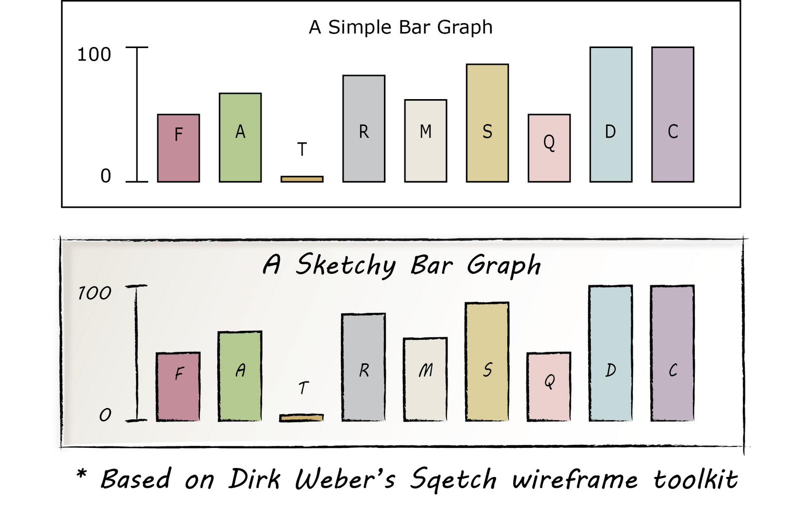
A solution came about as I was googling Illustrator wireframe toolkit and found Sqetch. As you can see below, it can be used to create attractive, sketchy wireframes.

Sqetch has a couple of problems from my perspective. The first is that it loads very slowly. See all of those textured backgrounds? My laptop takes its time rendering them. That makes it not fun for rapid prototyping. The second problem is that it almost looks too good for initial prototypes.
However, there are some things that I learned from the toolkit.
- You can make any path look like pencil in illustrator by using the right sketchy brush.
- If you do that and turn your rectangles into four slightly overlapping lines, it you get that "hand drafted" style.
- Use a hand drawn font. Sqetch uses a font called Nymph's Handwriting, but Microsoft has some built in that work just fine. I'm using MV Boli right now. Segoe Print is also good. Also, the Google Webfonts project has a nice one called Delius.
- With care, you can use gradients, transparency and brushes if you want some of the textures that you see above.
- You can save UI elements (buttons, text fields, etc.) in Adobe Illustrator as Symbols for rapid reuse.
UPDATE: Found a nice tutorial that shows how to make any font look sketchy. The tutorial is for fonts, but you could use this anywhere you want a rough "crosshatch" fill. The secret is to use the "scribble" effect on the fill and the "roughen" effect on the stroke from the Appearance panel. Here are the specific settings they use on those effects:
- Scribble: Angle to 45, the Path Overlap to 0 px, the Path Overlap Variation to 2 px, the Stroke Width to 1 px, the Curviness to 0, the Curviness Variation to 50, the Spacing to 2 px, and the Spacing Variation to 1.5 px
- Roughen: Size to .5, select the Relative radial button, change the Detail to 30, and select the Smooth radial button for Point


No comments:
Post a Comment